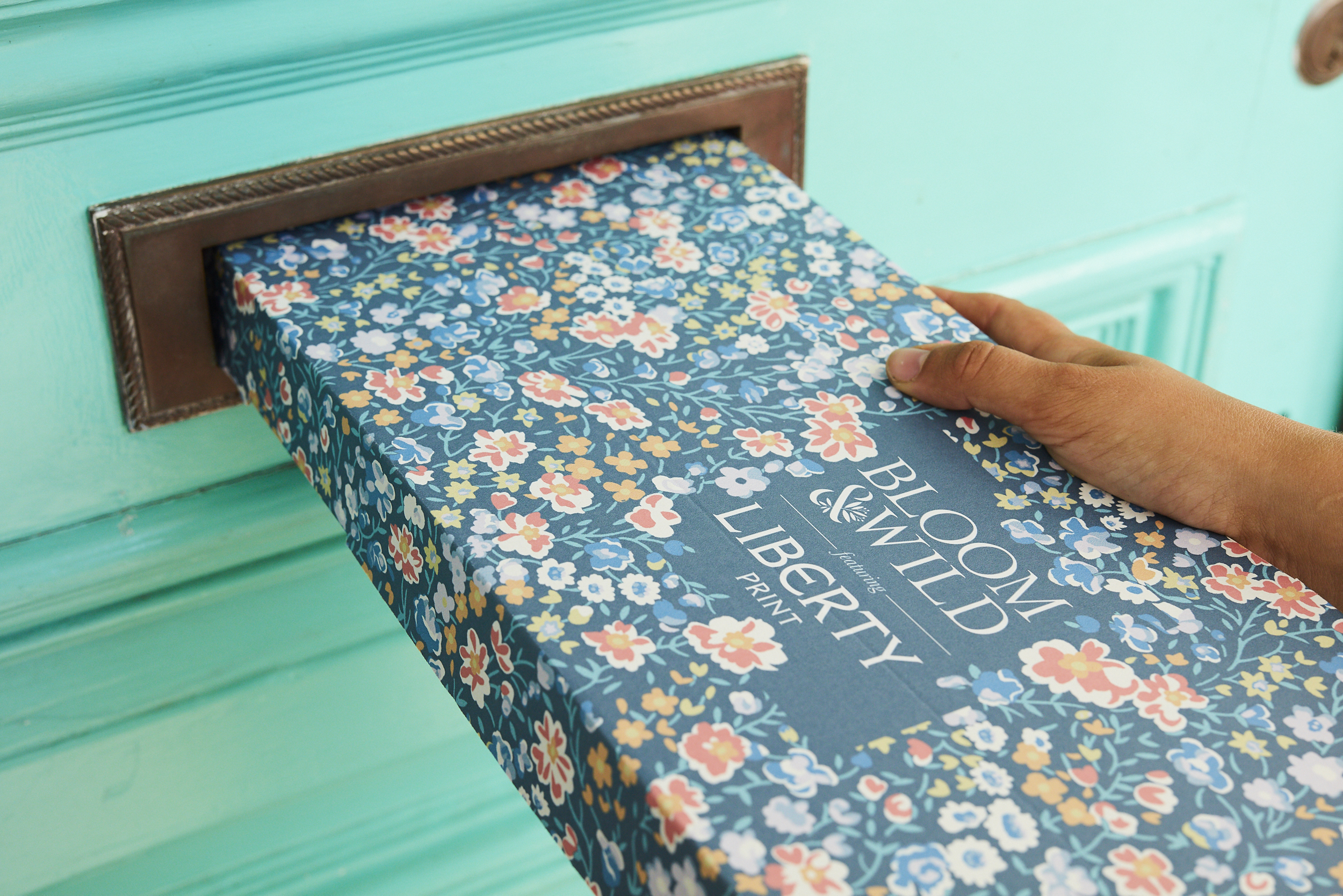
Misshapes: the making of Tatty Devine

We’re long time Tatty Devine fans and have featured their super fun acrylic jewellery in our fashion shoots and on our pages since we launched. But can you believe it? They are celebrating 20 years of their iconically kitsch jewellery. Founders Rosie Wolfenden and Harriet Vine set up a market stall in Spitalfields Market in the nineties! And now they are a force to be reckoned with and have challenged traditional jewellery conventions, we sat down to have a chat with the pair to find out how it all began...

Harriet Vine and Rosie Wolfenden founders Tatty Devine © .jpg

We love what you do. Did you ever dare to believe that Tatty Devine would be what it is today when you set up your market stall 20 years ago? RW: We were ambitious, but to become artists rather than create an accessories brand. We were very much living in the present, enjoying ourselves, excited by what lay ahead of us, rather than deciding what that might be.

What first inspired you to create your iconic jewellery? And what other styles were around at that time? HV: We were inspired by making things to get dressed up in when we went out, we were avid collectors of 'stuff' but were never content with leaving it at home, so we'd wear it out – whether it was a macramé owl or a collection of key rings! 

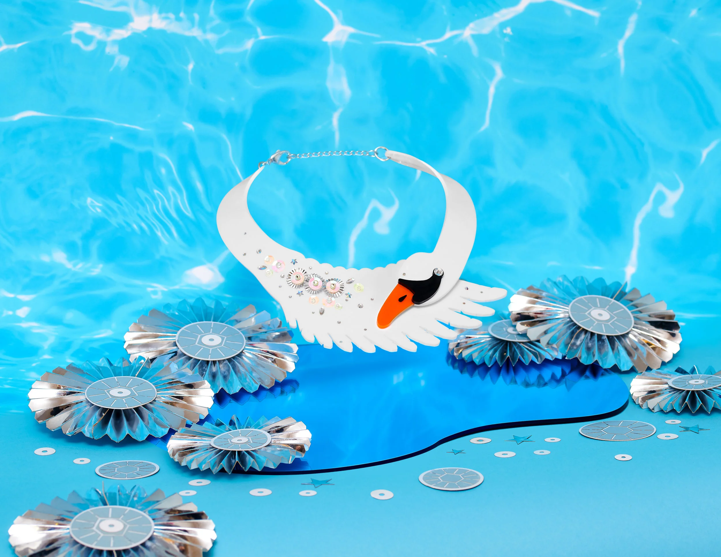
Swan Set.jpg

Styles around at the time were very much ’80s throwbacks, the Chloë style aviator glasses and Burberry was pretty hot – I had a bikini and Rosie had a vintage trench, tie and bucket hat!

Do you believe it is important to keep changing and recognising what is going on in the world when creating pieces? RW: Definitely, whatever you create is always a response to the world, whether in a subtle, zeitgeist way or a more overt political one. It can also be quite personal, but we're all affected by what’s going on in the world. Right now we’re working on a campaign for creativity called Make Your Future as craft and making have been affected so much by governmental policy makers in recent years.  Can you believe the number of students studying creative subjects has dropped 35% in the last ten years? Yet last year the creative industries contributed over £100 billion to the British economy, more than ever before.

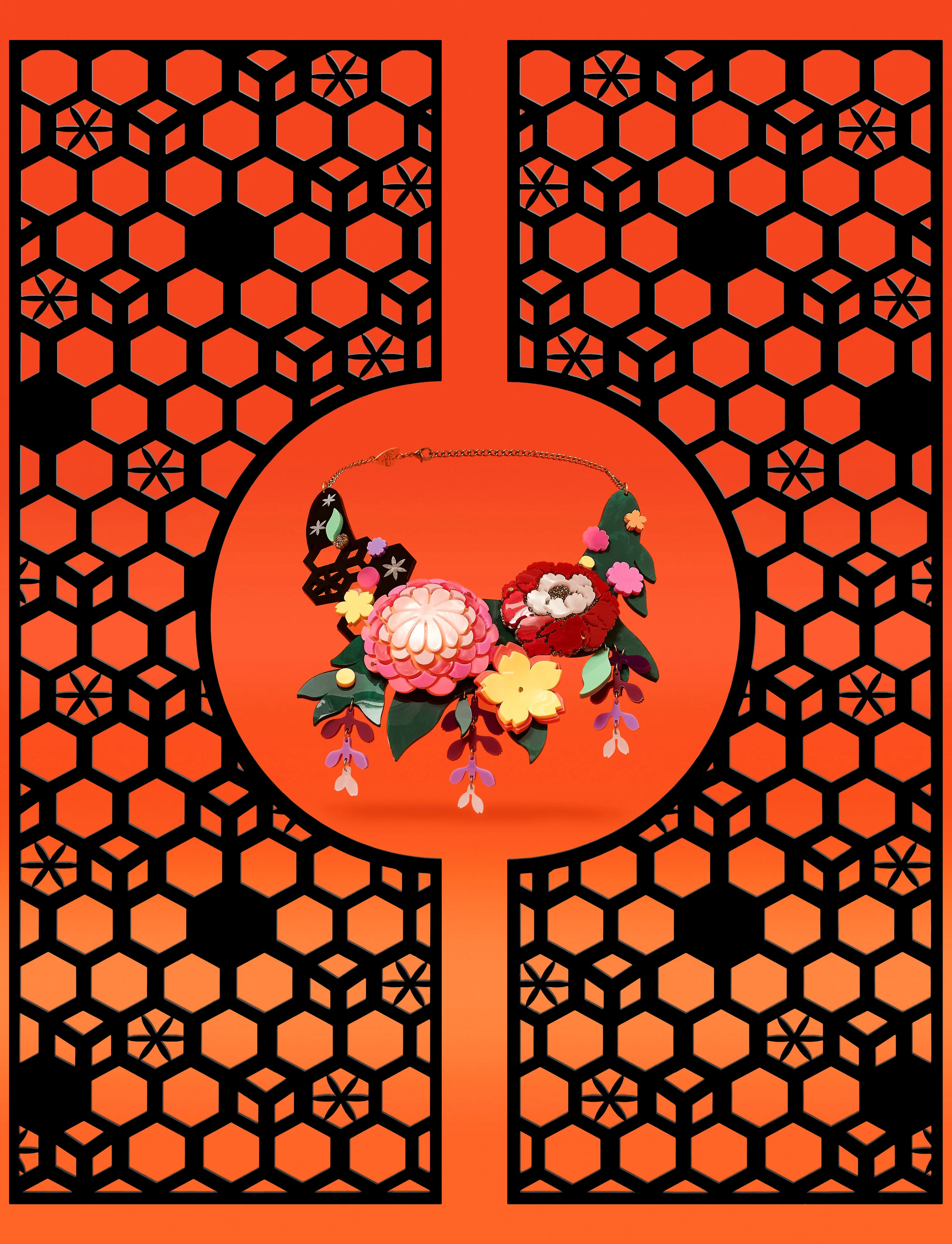
Komono Bloom_Set A.jpg

What has been your fave TD piece of all time? HV: It’s usually the one I haven't made yet. . . but the Arched Column Necklace from SS15 is a favourite, the pinkness really reminds me of the work I made at college.

RW: I wear the Parakeet Necklace a lot. I love the way it hangs and the array of different colours it comes in. It consistently gets more attention than anything else I'm wearing!

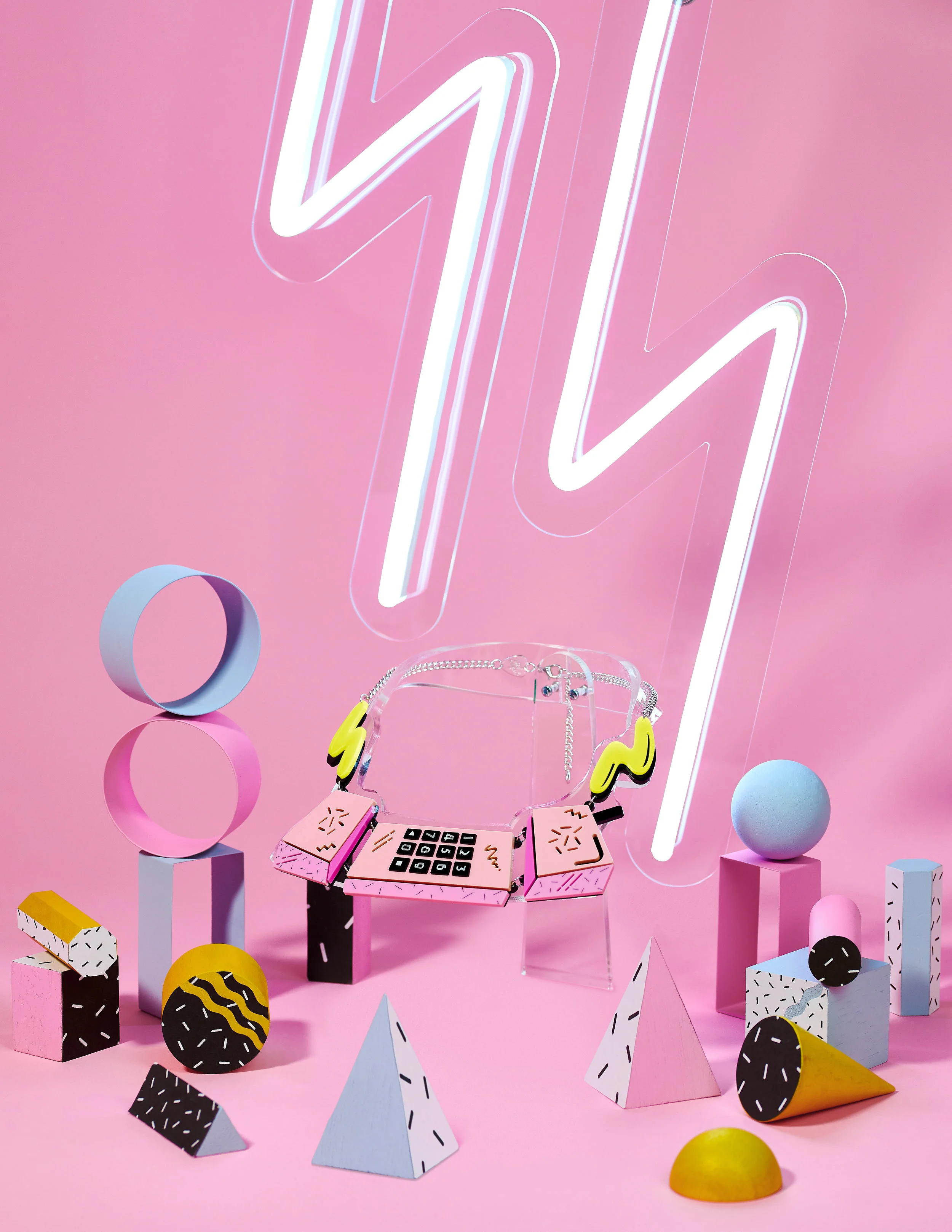
Memphis Phone Set.jpg


Tell us more about why you wanted to mark 20 years of Tatty Devine with an exhibition and what can we expect? RW: Curating an exhibition of our work has been an ambition for a long time, if only to try and make sense of what we've done! Twenty years is an in interesting point in time as it's long enough to have witnessed meaningful change both personally and externally. We have witnessed such phenomenal shifts which have both enabled and hindered us as creatives and business owners.


What is your advice for young creatives who would like to launch a business in 2019? HV: Just do it! Start simply, don't feel compelled to have a fully formed and realised business from day one. Don't feel pressurised to come across as a glossy perfect brand. People like a sense of what's real, and it's important you grow with the business.


If you were a piece of jewellery what would you be, and why?
RW: Something red and plastic, like a ’70s bangle.
HV: When I die I want to be compressed into a diamond – so I guess I'd be a piece of diamond jewellery.

Misshapes: The Making of Tatty Devine, at Lethaby Gallery, 1 Granary Square, King's Cross, London N1C 4AA, from 20 July 2019-11 August 2019. Visit craftscouncil.org.uk



Exclusive: Watch Jesca Hoop perform new track Outside of Eden

Acclaimed American singer-songwriter Jesca Hoop releases her new album, Stonechild, on 5 July – and she’s giving Oh Comely readers a sneak preview with an exclusive live recording of her mesmerising track Outside of Eden.

IMG_5724a1.jpg

Featuring Kate Stables from This is the Kit as well as Jesca’s nephew Justis on vocals, the track is the folkiest offering on her forthcoming release – featuring her trademark finger-plucked guitar. 

The song represents one of Jesca’s biggest concerns: the effect of technology on young people and their increasing reliance on electronic devices. On the track, she sings: “Come shut in boys for the girlfriend experience, enter the code and I’ll taste real”.

Watch it here.

Stonechild is Californian-born Jesca’s fifth release and also features the talents of Rozi Plain and Lucius. The album title was inspired by a trip to a Philadelphia’s Mütter Museum, where the Stonechild is a sad display of an unborn foetus carried by a woman for over 30 years. “They become a hard ball of bones, a rock,” Jesca explains. “Phonetically, it's a beautiful sounding word – hard and soft – but also, I am taken by the idea of carrying something for a long time, perhaps in secret and then giving it up. I hope I have made an album of substance.”

Despite living in Manchester for more than a decade, Jesca normally records her music back in the States. This time, however, the recording took place in Bristol alongside renowned producer John Parish – best known for his work with PJ Harvey, Aldous Harding and This is the Kit . “It was time to step out of my comfort zone, my safe place,” she says. 

“Parish was a gentle collaborator – until he killed one of my darlings! I’ve never been so brutally edited, and I wasn’t shy about expressing my discomfort at the sight of my work on the cutting room floor… In some way, I think I actually enjoyed that treatment – being stripped back to the bare basics, albeit painfully.”

Jesca will be playing at a host of festivals in the UK and Europe over the summer, while she’s set to tour the UK in October. You can also read a full interview with her in our late summer issue.

Stonechild is released on Memphis Industries on 5 July. Her UK tour dates are:

01 Oct – Leeds, Brudenell Social Club

02 Oct – Bristol, Fiddlers

03 Oct – Manchester, HOME

04 Oct – London, Barbican

05 Oct – Cambridge, Storey's Field Centre

07 Oct – Gateshead, Sage

08 Oct – Liverpool, Leaf

09 Oct – Dublin, Soundhouse

11 Oct – Glasgow, Oran Mor

12 Oct – Edinburgh, Pleasance Theatre

13 Oct – Birmingham, Hare & Hounds

31 Oct – Oxford, The Bullingdon


Lee Krasner: Living Colour

Victoria Rodrigues O’Donnell visits Lee Krasner: Living Colour at the Barbican in London.

Lee Krasner, Springs NY, 1972 Photograph by Irving Penn The Irving Penn Foundation

Lee Krasner, Springs NY, 1972
Photograph by Irving Penn
The Irving Penn Foundation


The Barbican is currently showing the first European retrospective of Lee Krasner’s work in over half a century. From early self-portraits, to wartime window displays, charcoal life drawings and vast abstract paintings, the exhibition features almost 100 works spanning her lifetime, many of which are being shown in the UK for the first time. Forget the myth-making and violent splashes long-associated with Abstract Expressionism, here is an artist whose Modernist roots led to a career tenaciously experimenting with colour, shape and form.

Lee Krasner was born in 1908 to Russian parents who had emigrated to Brooklyn, New York. Like many other Eastern European immigrants at the turn of the century, Krasner’s family fled anti-Semitic violence and travelled to the United States in the hope of a better life. Although she could not pinpoint the origins of her desire to become an artist, Krasner was determined to forge an independent living from her art and had decided on doing so from a young age. In an interview, she recalled: ‘I made no economic demands on my parents so in turn they let me be… I was not pressured by them, I was free to study art.’


Lee Krasner Self-Portrait, c. 1928 The Jewish Museum, New York. © The Pollock-Krasner Foundation. Courtesy the Jewish Museum, New York.

Lee Krasner Self-Portrait, c. 1928 The Jewish Museum, New York.
© The Pollock-Krasner Foundation. Courtesy the Jewish Museum, New York.

Krasner had places at a number of prestigious institutions, including Washington Irving High, the only school in New York at the time to teach art courses for girls, and the National Academy of Design. The development of both her self-portraits and life drawings from this period are one of the most important aspects of the exhibition. Not least because tutors often found her output mediocre or would refuse to believe she could paint something like Self-Portrait (c. 1928) at all. Perhaps the most significant influence on her was studying under Hans Hofmann during the late 1930s. Hofmann was a German artist who had known Picasso, Matisse and Georges Braque while working in Paris. As a result, Krasner was taught a Cubist framework that she both respected and resented, particularly his propensity for making suggestions or corrections directly onto a student’s work.  

The exhibition begins with Krasner’s series of ‘Little Images’, abstract works painted following her move to an area of East Hampton called Springs in 1945. These paintings aren’t quite the spontaneous, sweeping brush strokes associated with Abstract Expressionism. The application of paint feels minute, calculated and precise. The emerging patterns are reminiscent of those that Eduardo Paolozzi and Nigel Henderson would go on to make together ten years later. However, the most fascinating work in this section is Mosaic Table (1947). Consisting of mostly blues, oranges and greens, Krasner constructed the table top using coins, keys, broken glass and costume jewellery. The table sits proudly in the centre of the space – a stark difference to its origins as an old wagon wheel salvaged by Krasner during a bleak winter.

This tendency to collage or rework pre-existing creations runs throughout Krasner’s career and regarding this, she is known to have said: ‘I am not to be trusted around my old work for any length of time.’ When low and frustrated, Krasner had the habit of tearing up works – both old and unfinished – and repurposing them after a few weeks away from her studio. These new pieces, comprising of materials like torn newspaper, shreds of burlap and patches of paint, were shown to critical acclaim in 1955. Krasner would go on to do a similar series of pieces in the 1970s, this time using an old portfolio of life drawings from her time at the Hofmann school. Brightly coloured, large-scale works like Blue Level (1955) and Desert Moon (1955) have evolved into carefully composed shapes that slice across the canvas in a reinterpretation of her Cubist training.


Lee Krasner Blue Level, 1955 Private Collection. © The Pollock-Krasner Foundation. Photograph by Diego Flores

Lee Krasner Blue Level, 1955
Private Collection.
© The Pollock-Krasner Foundation.
Photograph by Diego Flores

The rest of the show feels impassioned and urgent, as if an electric current runs through the canvases. Whether it’s the enormity of her ‘Night Journeys’, painted during a bout of insomnia following the death of her husband, or the eruption of colour and gesture in her ‘Primary Series’, Krasner engulfs the viewer. Paintings like Icarus (1964) and Siren (1966) are particularly dazzling once you’ve just been looking at the restrained palette in Polar Stampede (1960).

While visitors walk around the exhibition quietly contemplating the works on display, it’s only in the final section that you begin to hear a chorus of giggles erupt among the audience. They are all sat or stood around watching an archival film montage of interviews with Krasner. At a memorial held for her, the playwright Edward Albee said that Krasner ‘looked you straight in the eye, and you dared not flinch’. Upon seeing how sharp-tongued and direct Krasner is in these film clips, one leaves knowing exactly what Albee meant.

A number of critics have praised this long overdue recognition of Krasner’s place in the art historical canon, and yet in doing so, they have continued to discuss her work in relation to other, particularly male, Abstract Expressionists. Yet, I think the exhibition captures the sheer range and depth of her career in a way that couldn’t make her stand out more from her contemporaries, male or female. Looking back on her career, Krasner summed herself up perfectly: ‘I was a woman, Jewish, a widow, a damn good painter, thank you, and a little too independent…’


Lee Krasner: Living Colour is at the Barbican until 1 September 2019.

A chat with Doon Mackichan

Photo: lize mccarron

Photo: lize mccarron

words: Holly Williams

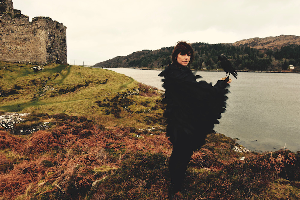
A comedian and actor, Doon Mackichan has worked as a stand-up and in influential TV comedies such as The Day Today, Brass Eye and Smack the Pony. More recently, she’s appeared in Toast of London, Two Doors Down and Pure, and has given acclaimed performances on stage in Twelfth Night and Jumpy. She also sings vocals in the jazz quartet Sea Crow (hence the outfit…). Her latest role is in David Mamet’s new play Bitter Wheat, alongside John Malkovich.

What can you tell me about the play?

It’s about a Hollywood mogul – people will recognise Weinstein, but it’s also any controlling, predatory man at the top of his game. It looks at how he operates – and how he falls. I’ve got the difficult task of playing his wing-woman, his PA. I have to find out who I am, to have allowed certain things to slip through the net.

Although I was lucky enough to talk to a woman who had been [Weinstein’s] PA for a few years – and a lot of the women didn’t get involved in the hook-ups. They knew he was a sleazeball, but they say they didn’t really know the extent of his predatory nature.

Do you buy that? Or do you think they were deluding themselves?

I do buy it. They knew he was lecherous, but they never thought it was rape. I have to believe those women, in my heart. They were all very bullied people; not many people stayed a very long time.

Do you think that, with #MeToo, we’re seeing practices changing in what young actresses are expected to do in auditions or on set?

I remember when it broke, feeling a massive relief. There were so many unprotected actresses, I was almost thinking about going into drama schools and saying to girls: look, you do not need to do these nude scenes, you do not need to be standing on a table with your breasts out while 40 crew are walking around.

I think women are going to be able to say ‘I’m not very comfortable’ or ‘I don’t want to do that’ now. It just feels that a door has been opened, to not be seen as the difficult one if you say something. It’s the beginning of a sea change – I hope.

Is it something you’ve had direct experience of yourself?

I’ve always said no to nudity unless it was going to be a radical lesbian feminist film! If I’m working for a kickass woman, I’ll definitely get my tits out – but not for a horrible old sleazeball. I’ve been in quite a few auditions where I’ve said ‘well is this really necessary?’ and then there’s been a rolling of the eyes. I’ve said I wouldn’t be nude and then I get on set and I’m asked to drop a towel… I was pressured, made to feel like a prude.

And I’ve tended to keep away from storylines that involve violence against women unless it’s dealt with in an incredibly careful or different way. We don’t have to keep seeing it – we’ve seen enough! It’s so exhausting, so debilitating, so bad for your self-esteem. If men saw the amount of rape we see, they’d be like ‘oh fuck this, I’m not watching Game of Thrones, I’ve had enough’.

Going back to Bitter Wheat – some people have raised their eyebrows at a #MeToo story being told by a male writer…

I think it’s really important for women to tell their story – they should be commissioned. But Mamet is Mamet and he’s written it very quickly and he’s got a play on. It’s definitely the man’s story – but it looks at why he got away with it, how he operates: buying the critics, treating the writers like shit, bullying all his staff, hitting on young actresses… It’s about control and power.

Yes, it would be great if a woman had written it. But she hasn’t. So until a woman has written a play about it, we need to celebrate that it’s a really important story that needs to be told, now. I hope it gets all the conversations going, and makes people at the top go: ‘Christ, I can’t get away with that.’

What’s the tone of the play – is it a comedy?

I’m glad I’m going to be in the room, they probably hadn’t bargained for me! Because it is all down to tone, isn’t it? There’s humour in it – but it’s humour about a man who is flailing, and losing his grip. And that can be funny. But I know there was some controversy about it being referred to as a farce. There’s nothing farcical about rape. It’s not the subject of farce. That’s not anything I would be involved in, and if I feel uncomfortable with the way the story is being told I will make myself very clear. And if I’m very uncomfortable, I won’t do it.

You auditioned with David Mamet. What is he like?

I really liked him a lot. I thought he was a real powerhouse, he had great humour. I liked his no-nonsense direction – and I thought I would be able to say what I wanted. So fingers crossed it does go down the right road.

Do you think that laughter is a good way of taking on some of the more horrific things in our society?

Well, I’ve done ‘the most offensive television programme ever made’, the [2001] Brass Eye paedophile special! After that I was blanked, I couldn’t go to [collect my children from] school for a while. But when we’re dealing with taboos, it’s all down to the tone. We agreed, Chris Morris and me, that the way paedophilia was sexualised by Fiona Bruce on Crimewatch was just unacceptable: this sexy way of talking about it with a husky voice and a raised eyebrow and lip-gloss. It was really important to skewer it.

And laughter is also a good way of going ‘god almighty, that’s awful’. But it’s a fine line, to not make it just light or ridiculous – or to be at the expense of the female.

Do you feel like the nineties was a particularly important time for comedy?

We just had our 25-year reunion for The Day Today. It made us feel very old – but what a gang. We just a happened to be put in a room and told to start improvising. We did On the Hour for the radio and then that turned into The Day Today and then that turned into Alan Partridge – it was just this ball rolling. It was more open to letting people experiment, and giving people money, then.

Do you think the fact that comedy was seen as a man’s world affected how Smack the Pony was perceived?

We’d all been feeds for male shows for years. It was great to make the straight women the funny women – to turn it on its head, everything we hated about male sketch shows. We just made our own set of rules.

Really French and Saunders were the only other female comics at the time and it was bit like ‘oh well, we won’t get anyone else.’ Same when I was on the [stand-up] circuit – they’d say ‘sorry, we’ve already got Jenny Éclair’. Sadly, it’s still pretty much the same, after 30 years.

Why do you think that is?

I don’t know, it’s terrible. Every woman I know pleads and begs me to bring Smack the Pony back, because there’s not been enough like it, to take its place. It’s still the most ridiculous battle. There are women on the circuit, they’re just not on telly.

Do you get stage fright doing a play – or has stand-up cured you of that?

Stand-up has cauterised every nerve in my body. When you’ve done that in the Tramshed in Woolwich in front of 250 squaddies, nothing will scare you.


Bitter Wheat is at the Garrick Theatre, 7 June till 14 September

Inside the Sarabande Foundation...

Behind the doors of a very nondescript building behind the canals of Haggerston in east London is the Sarabande Foundation. More than 20 years ago, the foundation was set up by famed fashion designer, Lee Alexander McQueen as space for creative minds to work. Named after McQueen’s 2007 Spring/Summer collection, the foundation provides scholarships to students, as well as being a physical space to house artist studios. When you visit, you find McQueen’s personal art collection scattered throughout the building. The foundation also offers its artists mentoring, peer-to-peer support, workshops and a gallery space to show off their work. On a bright spring morning, we sat down with four of the foundation’s brightest creatives to get a glimpse into their working worlds.

You can read about them in our latest issue, and you can meet footwear designer, Kristina Walsh below.

Kristina Walsh. Photo by Kristy Noble

Kristina Walsh. Photo by Kristy Noble

There’s something poetic about shoes and the idea that they walk you through life. They affect how you move in your environment. I trained as a footwear designer and, while studying, I saw an exhibition that featured a prosthetic leg and my mind was blown. I knew that’s what I wanted to work with because essentially it’s a shoe. The way that something looks really affects how people feel about their bodies. It will become a part of her wardrobe and the beauty of the design must be considered. 

There are so many different emotional experiences to losing a limb and when working with an amputee there are a lot of big issues you’re working with. You have to involve the person who you’re designing for because you’re designing a part of their body and life. I am working with a performer named Erin, who is an amputee, and it was so incredible watching her try on my designs for the first time. Emotionally, it was indescribable – it will be part of her. We started with two prototypes carved from wax that she chose from. You have to consider everything from how tall they’ll be to how heavy. Once the final design is chosen, they’ll then be made from carbon fibre. I’m working with other disabled and non-disabled dancers and performers who have adapted their practices to suit new movement. My designs have to be functional, so it’s a really specific way to work when you’re designing for people who have to dance. This practice makes you think about how you use footwear. 

A lot of my work is not just about physically connecting people, but emotionally too. I also design jewellery and even when I design rings I want there to be an element of feeling and touch about them. I learnt how to work with jewellery from my Sarabande neighbour James so being here really helps you work across disciplines.

Meet three other creative women from the foundation in our latest issue

Young, tattooed and black

Here in the Oh Comely office, we have been devouring Candice Carty-Williams’ debut novel, Queenie, darkly comic, we were with Queenie every step of the way. Here author Candice tells us about her first tattoo…

Photo by Lily Richards

Photo by Lily Richards

At 22, I suddenly decided that my life would be better if I got a tattoo. I knew absolutely nothing about them, so popped into the dodgy parlour round the corner from the my house that still exists and, to this day, has never had another customer but me. I walked in, was hit by the smell of weed, neither of the men who ran it looked at me and, after asking if I could have the outline of a heart on my stomach, one of them printed out one of those literal old school Microsoft Word heart templates and buzzed that onto my stomach. Now that I think about it, that parlour was potentially a front for drug dealing but I’m no snitch so refuse to comment further or give away the location.

I had to hide this tattoo from my nan, head matriarch, because I’m the first person in my family to get any tattoos. When she eventually saw it, she kissed her teeth and said, “if you were going to ruin your skin you should have gone bigger than that.” Challenge accepted. Not put off by my terrible first experience but ever-so-slightly wiser, my second tattoo was properly researched, thought about – I had a consultation and everything – and went to a legit parlour on Frith Street.

Two day later I stayed at my nan’s, hiding tattoo number two because I wanted to present it when it was fully healed, but the jig was up. I found this out when I was trying to eat my toast. “Can?” She called from upstairs. “Yes?” I answered, expecting to be asked to do one of a hundred chores she had lined up for me. “What’s this in the bed?” she shouted down. “What?” I asked as I walked up the stairs. “Show me,” she said, not looking at me, but instead looking at the black and red tattoo scabs that had peeled off in the night. “It’s nice, isn’t it?” I asked, holding out an arm. And that’s how we both almost fell down the stairs and broke our necks, as she chased me round the house – an exciting and legendary day in the Williams household.

To celebrate a break-up and my freedom, having heard about an amazing tattoo artist in Shoreditch, I went for a consultation with a picture of a castle that was maybe the size of your average post-it note and, two weeks later, left with one covering my entire thigh. The tattoo artist mentioned that most castles have names, and wondered what I’d call mine – we had a lot of time to talk, as this one took four hours. “What’s your middle name?” I asked her. “Elizabeth,” she said. “And my surname is Taylor.” Thus, all are welcome to visit Elizabeth Taylor Castle on my right thigh.

When I went to LA a few years ago, there was a tattoo parlour near the place I was staying that looked exactly like an LA tattoo parlour should look, so I basically ran inside, lifted up my shirt to show my first tattoo and said, “I think it’s time to cover this up” and, never one to go small (at my nan’s loose suggestion), had a four-hour session with a tattoo artist who also happened to be the lead singer of a rock band. It was the most American experience of my life to date. He would keep saying “tell me when it’s, like, feeling gnarly?” and said “right on” and high-fived me when he asked whose name I’d like in the new sailor banner he’d just inked on my stomach and I said “Candice”.

My current favourite tattoo is my latest one, SOUTH on my left arm. Again, probably too big. So much research went into this one; I asked a friend who knows loads about fonts what the best one to use for this tattoo would be, and he said, instantly, “Uh, how about the one designed specifically for south London street signs?” It doesn’t really get better than that, does it? Especially as I get to explain that fact to every single person who asks what it means, or to every family member who trolls me by hilariously saying “Is that in case you forget where you’re from?” as though they haven’t all heard each other say it before.

I’m planning my next tattoos as I write this. I have no idea what they’ll be yet but I can guarantee they’ll be big, they’ll be meticulously planned, and they’ll either get me chased around a house or targeted for bants in the family group chat.

9781409180050[1].jpg

Queenie is published by Trapeze and is out now.

Stocksy – curated with love

Stocksy is so much more than an image library. Its website is home to a curated selection of royalty-free photographs, illustrations and videos that have changed our expectations about what stock images can do. They’re also a co-operative believing in creative integrity, fair profit sharing, and co-ownership – every voice is heard.

We'll be meeting some Stocksy artists over the coming months to find out more. Next up is Jessica Woodhouse, who’s based in Portland, Oregon. (You can also meet Liliya Rodnikova here)

What are your favourite colours to work with? I love using warm colours and earth tones because I feature nature in my illustrations. I feel like it gives my work an organic and relaxed feeling. That being said, I’ll use bold colours and pastels when the mood strikes.

What inspires you? So many things bring me inspiration! I have a lot of strong, supportive women in my life who I represent in my work. I love vintage style and try to incorporate vintage fashion and objects into my drawings. Riding my bike around Portland, which connects me to my surroundings in a completely different way, has been a source of endless creativity. Leaving town for a few days of solitude in nature has always been something that gives me clarity and new ideas.

What is the creative scene like in Portland? I moved to Portland about four years ago and it’s been the perfect place for me to focus on growing my business. I’ve found the creative community here to be very supportive of each other, especially women supporting other women. I don’t know where I would be if it wasn’t for the network of creative friends that helped me get established as an artist.

The laws surrounding cannabis use are very different in Portland to over here in the UK and we’ve noticed you like to feature it in your work… I think the stigma surrounding marijuana is quickly fading away and I want to represent it in my work because I believe it’s important to normalise its use. I live on a street with more cannabis dispensaries than coffee shops. It’s everywhere, it’s commonplace, and that’s great for everyone in the community.

How do you get past the fear of a blank page? Sitting down at a blank page can be so overwhelming! It’s easy for me to brainstorm and develop a sketch when I have to work within certain parameters. When I am starting from scratch I like to pick a narrow topic like riding a bike, traveling, cooking dinner with friends, etc. I’ll sketch out four to five scenes and, inevitably, I’ll see potential in one of them. From that point, I’ll dive into the deeper process of creating a final piece. When I limit the possibilities it’s much easier to focus.

What creative project would you like to work on next? I would love to continue developing my animation skills and eventually work on creating a series of videos with sound effects and music.

And your dream commission? I would love to create more illustrations to accompany stories for newspapers and magazines, especially more animated gifs that can be used within online publications. Most people, including myself, are getting their news and magazines digitally these days and I can imagine there will be loads of opportunities to create animations specifically for an online audience.

What materials do you use in your illustration? My illustrations are created digitally. I use an iPad, Procreate, and Photoshop to create all of my work. It’s so easy to draw anywhere, wherever I'm travelling. If I'm at home and I have only 20 minutes, I can get on the computer and jump into my work right away. That said, I love painting with gouache when I have the time and the space because nothing beats working with physical materials.

Stocksy: stock photography + cinematography, made with love


The Western Wind by Samantha Harvey

In a brief pause on her whistle-stop book-signing tour, our book club editor Terri-Jane Dow caught up with author Samantha Harvey over a cup of tea in a bookshop basement to talk about Samantha’s new novel The Western Wind, covering story structures to how faith and secrets vie for power in the tiny 15th-century parish of Oakham.

Samantha Harvey, photo by Matt Lincoln

Samantha Harvey, photo by Matt Lincoln

The Western Wind, a novel told backwards, looks at faith and power in a tiny 15th-century parish. Oakham’s wealthiest resident, Thomas Newman, is seen floating in the river on Shrove Tuesday, four days after his disappearance. A Lent visit from the Dean means that Oakham’s priest, John Reve, needs to find the murderer, when there perhaps isn’t one, and needs the Dean to leave before he finds anything more disturbing going on. Samantha Harvey’s latest novel is not a who-dunnit, but a why-dunnit and, by moving the focus from what could have been a straight detective novel, the result is something far more absorbing.

Terri-Jane: What drew you to write about this 15th-century village?
Samantha: What came before anything else was an abstract idea about wanting to write about confession. I went for a walk, and the concept, and the character of John Reve, the parish’s priest, came to me, and the idea of the story going backwards. Then I had to find a time and a place for it. I wanted it to be a time where confession was the social norm, and I ended up, really against my better judgement, in the late 15th century. I wanted the village to be somewhere that was on a potential trade and pilgrim route, but couldn’t exploit that because it didn’t have a bridge. So I looked at a map and invented Oakham. I could tell you exactly where on a map it is, but it’s not there.

T: The structure of the novel was so compelling. Why did you tell the story backwards?
S: I hadn’t meant to write a reverse narrative. I felt like it was a bit gimmicky, but it had come to me so solidly that when I tried to do it the other way, it wouldn’t work. I thought that I could take the readers expectations and subvert them, and make them less interested in the what and more in the why. As a reader, I’m not that interested in the gasps or the big reveal, but the workings of the human heart and mind are endlessly complex and endlessly renewing themselves.

T: There’s a sense Oakham is within reach of progress, but just can’t get to it. Reve supports the idea of a bridge, but he still wants to stay at the centre of the village, and he can’t have both.
S: Reve wants Oakham to modernise and thrive and flourish, but not if that threatens his position of power in any way. I wanted him to be a character who behaved as most of us would behave. Medieval priests would have this enormous power and trust from their parishioners, but also have immunities. You can’t go to Hell, you probably aren’t going to even go to Purgatory. Why would you ever want to lose that status? It’s your ultimate insurance against a sorry afterlife.

T: The book describes a ritual where Reve has to stand at one end of a boat and one of his parishioners at the other end, so that he can be weighed against a ‘regular man’. Even though it’s theatre to the extent that the other man has stones in his pockets, there’s a flicker of doubt in him that he’ll pass the test.
S: It must have been a peculiar thing. He will have known, as all priests of course know, that they are just like other men; they’re flesh and blood; they’re not halfway to the angels. At the same time they must really have believed that they were the mouthpiece for God. What a strange paradoxical position to always be in. The idea of the whole thing being a theatre that you have to play along with, but you also have to believe in it as if it weren’t theatre.

T: There’s a running theme through the book of the power that the church has in the village; before Thomas Newman’s death, he’s been away travelling and come back with some strange ideas, like that maybe he doesn’t need a priest.)
S: I wanted to look at that question of grief and loss, but also to look at divine power and how that was rationalised. That entirely Catholic society of the 15th century was very complete. If you would abide by it, the church gave you everything. It was your religion, it was the safety of your soul, or your body, of your afterlife. It was your insurance and your education. If your priest was trustworthy and cared for his parish, it was quite a complete system. But if you wanted to ask questions, or bypass your priest, it didn’t work so well.

T: The visiting Dean brings a much stricter version of that faith with him. He starts out as an unlikeable figure, but by the end, you realise that he just knows about some things that shouldn’t be going on.
S: I never saw the Dean as a nasty character, but I wanted him to come across like that in the beginning. His and Reve’s character arcs form a cross, and the Dean goes up in your estimations as Reve loses some grace. That’s the way we all are: complicated and flawed. Telling the story backwards meant I could tell the story from where they ended up, and then reveal things about them. I wanted to play with the effect that time has on a character. It was also quite fun, for the first time in my writing life, to write a villainous character. All of this is from Reve’s point of view, so of course his interest is in depicting the Dean as an adversary. And then we see that the Dean has more depth to him.

T:  Reve justifies his actions as protecting Oakham, when really he’s just saving himself.
S: There’s the dual side of his character as man versus priest, but he’s also a self-centered individual and a person who has genuine compassion for his parish. Without a strong priest, a parish would be quite vulnerable. He’s caught between those two sides; for himself over a parish which is being corroded by a threat to his status. It’s not just his job; if he’s no longer needed as a priest, then does that mean he’s no longer safeguarded? Everything is at stake for him.

9781784708030.jpg

The Western Wind (Vintage) is out now

Eventually, by Emma Laird

image002.jpg

We worked with model Emma Laird, from Models 1, in our sustainable fashion story for issue 42, take a peek here. We’re thrilled that Emma has just written her first novel: Eventually,. Here’s an extract and interview with Emma about her inspiration.

We ate salt and vinegar crisps here. We talked and laughed with the old locals who had their regular seats around the room. Through the alcove to my left led into a small room taken up by a pool table and rack of old cues of different sizes. There were still holes in the ceiling where I had, on numerous occasions, punctured with my cue in light anger at my defeat, to which the owner had always laughed off while his Jack Russell had run to collect the falling dust with his tongue. 

It felt wrong coming here alone as if the place had turned sad in our absence – or my presence, alone. I finished my drink and left with a goodbye to a girl I did not know behind the bar. I took one last look at the outside, with its beautiful brickwork and arched doorway, and the windows that were so poxy you might question why they were there. So much character deserved to hold such memories. I didn’t think I would ever return here, so I smiled and turned my back on another one of my favourite places. 

If her touch were a sound 
it would be 
the soft crisp crunching of leaves 
amongst the silent of the forest
it would be
the glide of fingers
over the finest of silks
the rustle of sheets 
masking the natter of morning birds
the delicate crackle of a cigarette 
as you inhale its fumes 
and see the red burn dance downwards
chasing your clutched fingers
what if you still crave something more 
if crisp sheets and cigarettes aren't enough
to mask what was before
you might hope her touch 
to be more like
the jab of a needle 
the burn of your throat at the passing of whisky 
the fading pain of a hit to your hip bone
from some hiding furniture
the breeze floating around the wound
 of a scab that you just reopened 
opened 
opening 

-Sacrificial 


Tell us about novel? Who are the main characters? The main character is Kora. It’s the telling of how she meets her boyfriend (Bryce, a musician) during a summer of English music festivals. Then while working in Utah, she falls in love with a woman named Grace and has this seemingly impossible task of deciding what to do – trying to follow her heart and not hurt anyone in the process.

While you might say it’s a romantic novel, it’s better described as a story of self acceptance, of learning to be okay with your own company and your own thoughts. Kora realises you can’t use these exterior things (relationships) as distractions from that. 

The book is written in first person, how did you become the character in your novel when writing it? I find it much easier not to judge the character when I’m writing in first person. It felt really authentic while writing, I found it easy to keep her character traits consistent. Though I must admit, the main character is a lot like me in the way she thinks, not how she is perceived, but definitely how she thinks. The book is almost a vent for my thoughts that maybe I’m a little ashamed of. I shielded myself, I used those thoughts but changed them into Kora’s – I turned them into fiction. It let me offload. I could write almost like I would in a diary. 

So in a way, it’s autobiographical? Definitely. I think why I’m so happy with this book is because I’ll pick it up in five years’ time, read a poem or a chapter and be reminded of a moment in my life. Not a lot of what happens in the book literally happened to me, but it stemmed from something which I used as fuel to evoke the emotions into the plot. It’s very personal while also being hidden behind the story – I love that, the mystery in people still not knowing what bits are from my life, but getting that really raw and personal reading experience. 

Tell us about the process of writing your novel? I’d already written bits of fiction with no real motive. As something to do, usually while travelling – me and a friend would write bits and talk of book plot ideas, send extracts back and forth and have fun with it. I am a model, so I am on my own a lot – that was my go-to boredom killer. With this book, I was thinking a lot about a past relationship, I was yearning this perfect guy in my life and so I created him in this book – with all the best qualities and moments from past experiences with boys. I was releasing that nostalgia of my past relationships and little personal moments that could otherwise be forgotten.

Where do you like to write? I wrote the novel in a coffee shop in Crystal Palace below my apartment. I went almost every day and wrote little bits. In fact, I was writing this book when I shot a story with Oh Comely last year, but at that point I still didn’t know it would be a book.

Top tips for writer's block?

There are three things I’ve found found really help: 

 1. Going for a walk, preferably at night, sometimes with music, sometimes without is good to really address your thoughts and take in your surroundings. That usually leads to some messy writing in my notes page until I get back home to my laptop. 

2. Hanging with close friends. The ones where you have those deep chats about random things like aliens and the future. In January, when the book was pretty much done, I spent time in Devon with my friend shooting a film there and we chatted for a while in the dark of her attic before sleeping. That stuck with me so much that I added that into a scene with Kora and Grace in Utah. My friends should be careful of what they say I guess, it might just end up in a book.. 

3. Reading. The Shining, weirdly, has been a really big help in writing. Stephen King’s similes and metaphors are beautiful, he gives you such a vivid view in your head of the story, and that was something I really wanted to replicate. Reading different authors is important too, to learn their different styles of writing. My NY resolution was to read a book a month.

Did you enjoy writing the book? Was the process as you imagined it would be? I loved it. I really did. It was so therapeutic. This past month was a bit technical and pressured with getting it out there and making sure everything’s perfect. I’m still absolutely petrified for people to read it. But I also know that there are some really beautiful moments in there, I hope people can take something from this book about being content in life, with themselves and their own thoughts for company. 

Would you write another? For sure. I’m excited to really challenge myself with a different genre and style of writing. I want to write third person, outside of the world that I know. I already have so many ideas, I’m at that really exciting stage, anything can happen... 

You can order Emma’s book Eventually, from Amazon.

Thinking outside the box with Bloom & Wild

Are you an ‘Outside the Box’ thinker? Bloom & Wild are inviting Oh Comely readers to unlock their creativity by designing a letterbox this March. 

042A2413.jpg
042A2442.jpg

Bloom & Wild’s mission is to make sending and receiving flowers a joy again, so that you can be there from anywhere for those you love. We’re on board with that idea. And they are calling all creatives who want to join their high-profile packaging portfolio to submit their designs for the brand’s well-loved letterbox. The winner will receive a commission of £2,500 and have their box seen by thousands of Bloom & Wild’s customers.

Over the years, Bloom & Wild have collaborated with brands and designers to create beautiful boxes for their bestselling letterbox flowers. Brands include Liberty London, Boden, Mother of Pearl and Peggy & Kate. Like us, creativity is at the heart of what they do, and they’re excited to begin the search for a new, up-and-coming designer to create the next pattern for the letterbox.

The Design Brief:

The theme for their range is ‘Summer Brights’. Featuring vibrant cerise and coral tones, the flowers across this range are joyful, energetic and bold.

Keep reading to find out more…

bloomandwild_08_05)18221049.jpg

Right, read carefully, this is the important bit, to enter and submit:

Send a mood board to www.bloomandwild.com/outside-the-box that demonstrates your box-design concept. You can include a rationale to understand where your ‘Summer Brights’ idea came from, plus examples of previous work you have done to show your style.

The winning designer will be asked to make their idea fit across the outside and inside of the box, plus the finer details. For example, the sticker and ribbon around the flowers’ cellophane and a matching gift card for customers to add at checkout.

To submit your work, click here, where you can upload a digital mood board, a scan of your sketchbook or whatever works for you.

THE PRIZE: We’ll announce the judges’ (there are four judges, including our very own editor Alice Snape) favourite entries on Monday 8 April 2019. The winner of this competition will be commissioned £2,500 by Bloom & Wild to turn their idea into a box pattern for the July/August ‘Summer Brights’ collection.

This also includes an original piece of design for the box outer and inner, plus suggestions for a sticker design and ribbon pattern/colour and a gift card cover design or designs (at A6 spec) that ties into your theme and can be selected by customers at checkout so the packaging sits as a set.

B&W-Stacked-Logo.jpeg

**The deadline is midnight on Sunday 31 March 2019 to submit your entry.

Good luck! Enter, here.


An evening with Scarlet Sabet, Zia Ahmed & Rose McGowan

On 27 February, we were invited to an exclusive evening of poetry readings: ‘Love in Other Words’ organised by cultural producer and curator Ryan Lanji at the Hoxton Holborn hotel. In between sips of wine and nibbles of olives, a room of about 30 people nestled in to listen to Zia Ahmed read poems about lost love and familial ties, Scarlet Sabet read from her new book ‘Camille’, and then we were treated to a special reading of the Erica Jung poem ‘Alcestis On The Poetry Circuit’ by activist, actress and author of memoir ‘Brave’, Rose McGowan. Here we have Erica Jung’s poem chosen by Rose and a poem from Scarlet’s new collection for you to read.

Rose McGowan by Lily Vetch

Rose McGowan by Lily Vetch

Alcestis On The Poetry Circuit by Erica Jung

(In Memoriam Marina Tsvetayeva, Anna Wickham, Sylvia Plath, Shakespeare¹s sister, etc., etc.) 

The best slave 
does not need to be beaten. 
She beats herself. 

Not with a leather whip, 
or with stick or twigs, 
not with a blackjack 
or a billyclub, 
but with the fine whip 
of her own tongue 
& the subtle beating 
of her mind 
against her mind. 

For who can hate her half so well 
as she hates herself? 
& who can match the finesse 
of her self-abuse? 

Years of training 
are required for this. 
Twenty years 
of subtle self-indulgence, 
self-denial; 
until the subject 
thinks herself a queen 
& yet a beggar - 
both at the same time. 
She must doubt herself 
in everything but love. 

She must choose passionately 
& badly. 
She must feel lost as a dog 
without her master. 
She must refer all moral questions 
to her mirror. 
She must fall in love with a cossack 
or a poet. 

She must never go out of the house 
unless veiled in paint. 
She must wear tight shoes 
so she always remembers her bondage. 
She must never forget 
she is rooted in the ground. 

Though she is quick to learn 
& admittedly clever, 
her natural doubt of herself 
should make her so weak 
that she dabbles brilliantly 
in half a dozen talents 
& thus embellishes 
but does not change 
our life. 

If she's an artist 
& comes close to genius, 
the very fact of her gift 
should cause her such pain 
that she will take her own life 
rather than best us. 

& after she dies, we will cry 
& make her a saint.

Scarlett Sabet by Lily Vetch

Scarlett Sabet by Lily Vetch

For Jack by Scarlett Sabet

You who let your own gift decay
You who I remember everyday, to honour my own face and pen,
You, who’s face I saw reflected in my grandfathers, Catholic forefathers
You who flinched unbearable under scrutiny
Who tried to exist as lightly as possible, through your own desecration, crucifixion, mortification
Who’s tears and fears were exacerbated by the Ocean
You who uncomfortable in applause put down your own book
You who destroyed your beauty with hops and yeast, smeared the vertiginous caverns of your face into red loss and shame
You who could not stand even five decades
You who were thrown drowning into the terrible sea and asked to analyse your breathing, your own loss of breathing and failing lungs You who wrote, anticipated the flesh, sampled flesh, was offered flesh then turned and left
You whose grave I gave my roses, lilies, boot heels and tears.
You who tried the unattainable, tasted the forbidden then lashed your own back in repentance
You who rode the highways, superior to sleep and disease for seven sun cycles
You who chose the unavailable for deep down you knew your destiny was unassailable
You who waited for a coyote of the road to say: as above so below You who held Beatitude so high and while you are not here you are everywhere
You who opted out in despair, you have created love everywhere
You who were born in the third month of the year, your Pisces stellium extinguishing your fire Mars, casting you the ceaseless Neptune King followed by fish all your life
You swallowed dust and oil, you kept the rhythm of a cool, cool Aquarius heart, that detached, split everyone’s loins in half

and Sewards’s progeny in hot Texas dust, his common law wife, her german face sunken of any life
You your eyes earnest soulful offered up the truth to be spat at like a lumberjack
You too young and pure, your voice like Massachusetts honey, but gliding
oh Jack O Lantern you burnt so bright, you were the guiding light,found guilty of illuminating the way sacrificed at dawn light, dear brother Jackson, you’ve got an emergency message, a date,
to sail the mystic sea, to swim with fishes you thought would be safer but the sea was a demon that promised You danger, you
were possessed with evil, your thoughts red and blue, repulsed by everyone that professed to love you
and I know, and you know, and Jimmy knows:
that we were all born rip torn and screaming, baptised in our bleeding, always chasing a womb of warmth heat and light in the desolate wasteland of life

Muscle Memory by Anna Liber Lewis

Artist Anna Liber Lewis and musician Kieran Hebden (better known as Four Tet) are life-long friends, and their deep-rooted dynamic fuels Muscle Memory: an exhibition of Anna’s art soundtracked by exclusive Four Tet music. We were lucky to see a live performance at Elephant West in London. The exhibition is on until 17 March, so we had a chat with Anna to find out more.

Childhood friends: Anna Liber Lewis and Kieran Hebden (Four Tet)

Childhood friends: Anna Liber Lewis and Kieran Hebden (Four Tet)

Anna, I adored your exhibition, and found it to be a really interesting experience looking at your art and listening to Four Tet, tell me how the collaboration came about? Thank you. I’m so pleased you had a good time. It was all organic. I listen to music when I am painting. And it became an important part of my process. I was spending a lot of time dancing to Kieran’s New Energy album, and it went from there really. I went down this rabbit hole, through music, that took me to our youth and the music we used to go out dancing to. I mentioned this to Kieran and asked him what he thought about putting a show together, he was into it!

What's it like working with your friend? Did you have any input into the music, and vice versa, Kieran with your art? Working with Kieran was so easy. We’ve known each other all our lives and we fell into a symbiotic way of working. I’d send him an image of a work in progress or track I’d been listening to and we’d reminisce about past times. Then he started sending me new music he was creating. We found ourselves communicating through the work we were creating. When you’ve known someone so long and you both work with your intuition, it doesn’t take much to have a meaningful exchange. We were both in charge of our specialist areas. The input into each other’s work was minimal, which I loved. I was always surprised by what he was creating, it made me listen harder to my gut. He changed a track slightly after my dad died, because it was too painful to listen to – too linked to that traumatic time. Layering became more important for me in this body of work: painting over, erasing, scrubbing back, his music helped influence this.

Cadence by Anna Liber Lewis

Cadence by Anna Liber Lewis

Tell me about the physical process of painting… It’s taken me a while to realise that I paint from my gut. In the past I have likened it to boxing or sex. I really love to create quite big paintings so that the canvases are almost a stand in for the body, it enables me to move my whole body, feeling the sensations in my arms and legs as I move myself and/or the canvas around. I love a good vigorous brushing action or squat to get to a place on the canvas. It can get exciting in the studio, although I wouldn’t want an audience! Painting is a unique space and it requires time – time to develop and time to digest.

 Where does your inspiration come from? I spent a bit of time in the Natural History Museum thinking about whales while making this body of work. I was trying to wrap my head around quite complex books on the theory of time. Mostly it came from trying to be present, to listen to my body and let the painting create this kind of feedback loop, which comes with time.

What’s the thinking behind the title of this body of work ‘Muscle Memory’? Titles are funny, sometimes they just arise. I’ll be painting, and a word or phrase will enter my head. Other times titles require a lot of thought, I may need to retrace my steps and follow the thinking or research I was doing during the making of a painting. Muscle Memory just came to me. I liked it for this show as it points to something physical; athletes and dancers talk about a muscle memory that develops after training. It implies that time is integral to the process, that maybe it can be left dormant, but the body can click back into it via a sixth sense: that’s what painting is like, you develop a muscle memory. It’s like learning something physical like swimming, which you can’t learn by reading a book, you must do it often, develop the muscle memory. Kieran and I liked that title as it could be interpreted in many ways and it also pointed to history of a very long friendship.

Felt(unspoken) by Anna Liber Lewis

Felt(unspoken) by Anna Liber Lewis

How does it feels to put something out there that you’ve worked on, on your own, into a very public space?  Once paintings are complete and go out into the world, they become something else and you must let go of them. This exhibition is quite a unique experience for me. I had to make a large body of work in a relatively short period of time, which was punctuated by one of the most significant personal losses in my life. Honestly, I haven’t had enough time to process it all. I’m so glad that the show has touched people that don’t know me and it has introduced me to people I may not have met otherwise. I’m so happy to have had this experience with Kieran. When he played live in the gallery I went into a very private, personal space. I was able to dance like no one was watching. I almost didn’t notice the crowd, I just felt the energy between Kieran and me. It was good to have our families in the space and I’m sure my dad was there for a moment. Both our dads would have got a real kick out of it.

Elephant x Anna Liber Lewis x Four Tet: Muscle Memory is on until Sunday, 17 March, 2019 at 62 Wood Lane, London, W12 7RH. Find out more here.

What We're Loving for spring

It’s International Women’s Day! And we’re in office today working on our next issue, celebrating all the wonderful women who feature on our pages. To tide you over to the next issue, here are some of the bits we’re loving right now… we hope you love them too.


Compiled by Alice Snape, Frances Ambler, Bre Graham and Terri-Jane Dow

Vaginagram.png

Lynn Enright’s Vagina: A Re-Education
With a timely publication date (the day before International Women’s Day), Lynn Enright’s Vagina: A Re-Education, is the most necessary book we’ve read this year. “It tackles the lack of education around women’s bodies and how they work with zero squeamishness and offers facts that I, a 31-year-old vagina owner, had absolutely no idea about,” says our bookclub editor Terri-Jane. It’s frank and fascinating, and provides much-needed information.


Everpress Sarah Maxwell.png


Some of our favourite artists and illustrators have created work for International Women's Day available on Everpress. We’re feeling all the emotions for Sarah Maxwell’s Heartbreaker and Rachel Louise Hodgson’s Mine tees. Each is available for three weeks only, so don’t hang around.


av-ig-3 (1).jpg
Amber Vittoria _ K-swiss.png

K Swiss have teamed up with Amber Vittoria to create ‘The Space is for You’ shoe. Known for challenging conventions about the “ideal” female figure through her art, this collab represents empowering women being comfortable in their own skin.
K Swiss will be donating 30% of all sales made today on kswiss.co.uk to You Make it, a charity empowering young unemployed women with the confidence, skills, knowledge and experiences needed to further their careers.

Screen Shot 2019-03-08 at 12.02.24.png

Sheets with a social cause… Treat yourself to something soft to sleep in. Rise and Fall make soft, simple sheets that raise money for the homeless charity Centre Point. Plastic-free packaging, low impact dyes and chemicals will all help you have a better night's sleep. Prices from £99, riseandfall.co


For emergency use soft shoulder, serigraph, 1966. Image courtesy of the Corita Art Center Immaculate Heart Community Los Angeles

For emergency use soft shoulder, serigraph, 1966. Image courtesy of the Corita Art Center Immaculate Heart Community Los Angeles

We’re taking some cues on to how to make a real impact from the work of Corita Kent, currently on display at London’s House of Illustration. Kent harnessed the power of Pop Art to get her message across, in dialogue with issues ranging from the Vietnam War to feminism and the civil rights movement. Oh, and did we mention that she was also a nun? It’s on until 12 May.


Memories of the Future.jpg

Siri Hustvedt novels are always inventive, exhilarating reads – where you don’t know quite where you’ll end up. Memories of the Future, out on 19 March, shows a 20-something ‘SH’ making her way in New York. Worth the cover price just for the introduction to the fabulous (and real) Baroness Elsa von Freytag-Loringhoven alone, a Dada artist who is very likely responsible – but uncredited for – one of the 20th century’s most famous artworks.


Photo: Kristy Noble / Styling: Gemma Therese Pearce

Photo: Kristy Noble / Styling: Gemma Therese Pearce

In our latest issue, we shine a light on the beauty products that are not only good for us, but also good for the world we live in. It’s made us really stop and think about what’s in our bathroom cupboards. We love this green clay face mask, from By Sarah London which contains matcha tea. We’re also pleased to discover the vegan hair dyes by Maria Nila for when we fancy a change. See what other brands we love in our early spring issue.


The first ever menstrual cup was created by actress Leona W. Chalmers in 1937. And now there are lots of amazing cups to choose from, including Intimina who have created this eye-opening timeline.

Copy of 100 Years Of Periods.png
 

Why not celebrate Women’s Day by buying a copy of Oh Comely mag for a wonderful woman in your life?

Creating community with illustrator Erin Aniker

London-based artist Erin Aniker was raised by an activist mother, is part of a female and non-binary led creative collective and was influenced by feminist theory at university. It is perhaps unsurprising then, that her bold and colourful illustrations often depict the faces, hands, relationships, nose rings and nail varnish of women. Ahead of International Women’s Day (Friday 8 March), she speaks to us about her feminist upbringing and her obsession with cobalt blue.

 Words: Hannah Clugston

Erin Aniker

Erin Aniker

You have discussed going on protests with your mother when you were young, how do you continue her legacy of protest? I still go to protest marches. I am also part of a collective called We are Here UK, which is a group of women and non-binary black and Asian minority ethnic artists across all disciplines. We started it after the EU referendum because there was a spike in anti-immigration rhetoric and I think a few of us felt quite angry about it. I suggested we do an event or an exhibition where we explore what it means for us to be British and from another background as well. For me, I can be British and Turkish – they are not mutually exclusive identities. I like to think of We are Here UK as a form of activism. Also, in my illustration, if I get asked to do an editorial commission on a group of people, I will make sure that group is inclusive and include as many different types of people as possible. I will not go to the default setting of drawing lots of white middle class men.

Would you call your work feminist? I would. I am proud to call myself a feminist. I don’t make work with the sole intention of it being feminist. I think because I am so passionate about it and I am a feminist, I guess it just comes through in my work. When I create a piece of work, at the end I check it and ask am I conveying the right message?

'Act!' by Erin Aniker

'Act!' by Erin Aniker

When did you realise you were a feminist? I think from quite a young age. I feel quite privileged to have had the upbringing that I did because my mum didn’t raise me and my twin brother separately based on our gender. That isn’t necessarily radical or feminist, but I noticed that a lot of my friends didn’t have the same experience. If my brother was out playing in the garden, she’d make sure I went out and climbed trees and did whatever I wanted to as well. And, if we were cooking, she’d make my brother do it too. So, I didn’t see things as gender-based tasks or roles, I saw them as things that everyone did.

So, you were raised a feminist? Yeah, and I would say my brother was raised a feminist as well because gender wasn’t something that affected our childhood from a parenting point of view. They didn’t treat us differently, they didn’t dress us in certain things and they didn’t give us specific toys. I am sure they did certain things that were gendered, but I think compared to a lot of my friends my upbringing was quite feminist.

illustration for AIGA Eye on Design

illustration for AIGA Eye on Design

Were women always a central interest for you in your work then? Definitely. I have automatically been drawn towards drawing women. My mum has always been a key figure in my life and a lot of my friends happen to be women. But, I think that my primary interest is people. I am quite interested in how things like culture affect us – I think being British and Turkish has impacted my work. My dad is a language teacher and speaks five different languages, and I grew up in east London so I am very interested in people and culture because it was something I was raised in. Hands feature quite a lot in my work – sometimes there are just hands and no faces, which removes gender but also reflects how I am really interested in people, community and how we can support each other, which I think is quite important at the moment.

In terms of the aesthetics of your work, what inspires you? I am inspired by Turkish textiles and ceramics. There is a strong use of cobalt blue in a lot of them, and there was one point where I was working in blue – like every single shade of blue – and then I started dressing in blue! I found it a really calming colour. I have come up with this colour palette that is bold and vibrant because I am trying to put things out there that are quite joyful, colourful and positive. London can be quite grey, so sometimes I even find myself dressing in bright colours.

unnamed.jpg

How do you think we should celebrate International Women’s Day? I am a little bit cynical about International Women’s Day or anything that is just one day to celebrate just one thing, but I do think women need to be celebrated. I guess, the best thing to do would be to use the day to support women artists and to support the women in your life. Champion the women that you love and respect, and advocate for women’s and human rights. And, if you are in a position of power, think about the amount of women and non-binary women of colour you have in your employment – are you paying them properly? Is there a wage gap between your employees?

Riposte X Amnesty International UK | Protection Exhibition

Riposte X Amnesty International UK | Protection Exhibition

Finally, choose one of your illustrations and tell me why it is important to you. I was commissioned to create an illustration about organ donation and religion and it is lots of hands from different backgrounds praying – or with hands clasped together – around a heart. On a similar theme, the illustration I created for Amnesty International to commemorate the anniversary of the Human Rights Act is lots of different hands all holding onto each other in a circle. The focus is on humanity and what we have in common as opposed to our differences. Both works are bright, powerful and positive. I think those two images definitely sum up what I want my work to stand for and the kind of work I want to create in the future too.

‘Palms’

‘Palms’

Erin Aniker will be at The Other Art Fair hosting a Protest & Power illustration workshop on Sunday 17 March, 11am-6pm. Erin has created a range of poster templates based on feminist icons or you can draw your personal feminist hero from scratch. Visit www.erinaniker.com


(1) CHARLIE CRAGGS .jpg
FRIDA KAHLO (1) -01.jpg
MIA MINGUS (3) -01.jpg
ANGELA DAVIS (3) -01.jpg
(8) MUNROE BERGDORF.jpg
(9) GLORIA STEINEM.jpg

How did you meet your mates? Tell us all in our survey

OC47.friendship_3fa.jpg

In our latest issue, we loved sharing stories of how we met our mates – and so we’re keen to know more about how you met yours... Share it all – from the moment your eyes met to the gossip and fall outs – in our friendship survey

Illustrations by Ella Masters

Illustrations by Ella Masters

“I’ve always desired that kind of friendship that endured time. Those bridesmaids at weddings whose sobbing speeches involved lines such as “I’ve known her since she was two!”. I wanted that Sex and the City kind of friendship. People who were going to be there for you at the drop of a WhatsApp message. And my friends didn’t just ask if everything was alright – they made it so.” In issue 47, Tahmina Begum writes about the friends that she made at school.

Share everything about your friends (well, as much as you dare, without starting a bust up) in our survey here. And we promise not to stitch you up to your mates.

Pssst, as extra incentive, one lucky reader will win a bundle of books (which you can also share with your pals)

Dorothea Tanning's Gothic wonderland

The first UK exhibition devoted to her work has just opened at London’s Tate Modern, so we take a peek inside the Gothic wonderland of surrealist artist Dorothea Tanning

“Women artists, there is no such thing – or person,” said Dorothea Tanning in 1990 (when she was 80 years old). “It’s just as much a contradiction in terms as ‘man artist’ or ‘elephant artist’. You may be a woman and you may be an artist; but the one is a given and the other is you.” However, for me, her disturbing, creepy and striking images are inextricably tied to issues of gender. Her world is female-dominated, a contemplation of what it means to be a woman. So timeless, and yet ahead of its time and more relevant than ever. 

Tanning wrote poetry, painted, made sculptures, her career spanned 70 years yet her name is hardly ever mentioned alongside her more famous (male) counterparts (including her own husband Max Ernst). She was born in 1910 in Galesburg, Illinois and studied painting in Chicago. Her first encounter with surrealism was in the 1930s, in New York. However her surrealist heart meant that when Tanning was a child, she shocked her family by painting a naked woman with leaves for hair. “Was I a tiny surrealist? [...] Maybe surrealist painters were children with years, playing with the irrational,” wrote Tanning in her memoir Between Lives: An Artist And Her World. Tanning also escaped the boredom of her hometown – although she admits to having a happy childhood – by reading Gothic novels, she also loved Lewis Carroll’s Alice in Wonderland, which you can definitely see elements of in her works.

Dorothea Tanning (1910 – 2012), Family Portrait, 1954 Oil paint on canvas Acquired in 1977. Centre Pompidou, Paris. Musée national d'art modern/ Centre de création industrielle Photo © Centre Pompidou, MNAM-CCI, Dist. RMN-Grand Palais /image Centre …

Dorothea Tanning (1910 – 2012), Family Portrait, 1954
Oil paint on canvas
Acquired in 1977. Centre Pompidou, Paris. Musée national d'art modern/ Centre de création industrielle
Photo © Centre Pompidou, MNAM-CCI, Dist. RMN-Grand Palais /image Centre Pompidou, MNAM-CCI
© DACS, 2018

Tanning’s artworks enchant me; they pull you in with all their layers and details – rabbit holes, if you will. They speak to my own thoughts and, for me, feminism is at the heart of that. There are endless open doors and there is chaos in domestic spaces. She subverts our expectations. Mothers reject their nurturing roles. Women escape the boredom of married life. Fathers turn into giants. Familiarities are made strange. You see this in her 1954 painting Family Portrait. Tanning plays with scale, commenting on hierarchy within the family unit. A father watches over the table, his huge body spilling off the canvas, his glasses Demon Headmaster-like look as if they are hypnotising his wife who is sitting next to him at the table. Her eyes are frozen, perhaps she is controlled by her over-bearing husband. She looks very young too, in fact like she could also be his daughter. The maid, who also looks like she could be the man’s wife, is the size of the dog. Dogs you’ll see are a recurring theme in Tanning’s work and life.

Tanning chose not to have children, a radical move for the time. “I’m very much against the arrangement of procreation,” she wrote. Her choice to not become a mother is embodied in Maternity (1946), the most famous work of a series of the same name. The first time I saw it at Museo Reina Sofia in Madrid, I felt a deep connection with it and my own internal debate about motherhood and whether it is something I want from my life. The mother looks worried, drawn and tired, she is dressed in a dirty nightgown, and she’s standing isolated on a grubby rug in the desert. The baby she is holding is huge and slightly grotesque with a face like an old man. Motherhood is not portrayed as a favourable choice here. The painting also features a little dog (she had many as pets) with a baby face, which is much cuter than the baby. Tanning perhaps using this figure in the way Frida Kahlo painted her pet monkeys.

Dorothea Tanning (1910 – 2012) Maternity, 1946-47 Oil paint on canvas Private collection © DACS, 2018

Dorothea Tanning (1910 – 2012)
Maternity, 1946-47
Oil paint on canvas
Private collection
© DACS, 2018

But it was her self-portrait Birthday (1942) that really changed the course of Tanning’s life. She depicts herself with bare breasts and no shoes standing behind a monkey-like creature with wings. She’s wearing a skirt of long, green tendrils, which you only realise when you look closely are tiny human bodies, she looks as if she’s just stepped out of a Shakespeare play. One of the many reasons I love her work so much, is that you have to really study it to notice every detail. You can go back to each work many times over and still spot something new. The figure/Tanning is not smiling, and her pose could be read as either self-assured or worried. The floor is tilted, and she grasps at a doorknob. But behind that door is another open door, and another and another. A common motif in Tanning’s work, one that disorientates you, throws you off balance. Because how do you know what each of the doors mean? Endless possibilities, something we cannot see beyond the canvas, perhaps turmoil, adventure or something else? Is she arriving or leaving? One of Tanning’s works in the Tate exhibition even has an actual wooden door in the middle of it.

It was at this time that Tanning met painter Max Ernst. Ernst’s wife at the time, infamous art collector Peggy Guggenheim, had sent him to check out Tanning’s work for an exhibition of women artists she was curating. Tanning did not want to be included in any exhibition that called her a “woman artist”, she refused to be classified (even as a surrealist) and this may be a tiny part of the reason that her story has been hidden, slipped through the cracks in history, and her work overshadowed. Tanning and Ernst fell deeply in love. It was Ernst who titled the peice Birthday, to announce her birth as a surrealist, he was captivated by it. After his first visit, the couple played chess every day for a week. Then he moved in, divorced Peggy, married Tanning and they relocated to Arizona before finally moving to France. 

Perhaps hinting at those games she played in their courtship, in 1944, Tanning painted Endgame in which a high-heeled shoe stamps upon a bishop’s mitre with so much force that it almost pushes through a chessboard. The queen here is clearly the leader. Tanning often felt that her role as Ernst’s wife overshadowed her work, and thought it unfair that the same could not be said for him.

Dorothea Tanning, Portrait de famille (Family Portrait), 1977 Oil paint on canvas. The Destina Foundation (New York, US) © DACS, 2019

Dorothea Tanning, Portrait de famille (Family Portrait), 1977
Oil paint on canvas. The Destina Foundation (New York, US) © DACS, 2019

From the 1950s, when she was working in Paris, Tanning’s paintings become more abstract and loose. Insomnias (1957) is one such work; it’s disorientating and, until you study it, you don’t even notice the big toe and face hiding out in the corner. She also painted another family portrait in 1977, starkly different to the one she painted in 1946, this version has writhing naked bodies entwined together – it looks more like a threesome plus a barely-visible dog, than it does a family portrait. Yep, her work is still quite weird and surreal even in its abstract form.

In the 1960s, she started making soft sculptures out of fabric. A 1976 film called Insomnia by Peter Scharmoni (which you can view at the end of the Tate exhibition) shows Tanning sewing the cushion-like creations together using a Singer sewing machine. It’s wonderful to see the creation of the works you have just viewed in the hands of the artist. I watched the film twice. You also get a glance at the Pekingnese dogs she owned, running down the stairs behind the soft sculptures Tanning has just thrown down them.

Dorothea Tanning (1910 – 2012) Hôtel du Pavot, Chambre 202 1970-1973 Fabric, wool, synthetic fur, cardboard, and Ping-Pong balls 3405 x 3100 x 4700 mm Centre Pompidou, Paris. Musée national d'art modern/ Centre de création industrielle Photo (C) Cen…

Dorothea Tanning (1910 – 2012) Hôtel du Pavot, Chambre 202 1970-1973 Fabric, wool, synthetic fur, cardboard, and Ping-Pong balls 3405 x 3100 x 4700 mm Centre Pompidou, Paris. Musée national d'art modern/ Centre de création industrielle Photo (C) Centre Pompidou, MNAM-CCI, Dist. RMN-Grand Palais / Philippe Migeat © DACS, 2018

Included in Tate’s exhibition is also the installation Hôtel du Pavot, Chambre 202 (1970–3), which is the size of an actual room (the film shows Tanning standing inside it). You see bodies – cushiony sculptures – growing out of the walls of an imaginary hotel room. It’s like one of her paintings brought to life. You feel that if you stood watching the space for long enough, you may witness something you didn’t want to see, as if it is a crime scene waiting to be filled with blood. The only escape (or entry?) is through a door left ajar. Tate curator Ann Coxon points out the resemblance to Netflix series Stranger Things.

The Tate exhibition also shows sketches for the costumes Tanning created for Ballet Russes, again strange creations with huge head pieces in the shape of antlers and ships. But it also features illustration work she did for Macy’s and other clients advertising products in the 1940s – proving all freelancers have to make a living somehow.

Dorothea Tanning, Stanza, 1978 Oil paint on canvas. The Byrd Collection, Arizona. © DACS, 2018

Dorothea Tanning, Stanza, 1978
Oil paint on canvas. The Byrd Collection, Arizona.
© DACS, 2018

When Ernst died in 1976, Tanning returned to New York and dedicated her time to writing – her 1976 painting Stanza depicts an agonised writer. Her last collection of poems, Coming to That, was published when she was 101. When asked at the age of 91 what she’d hoped to communicate as an artist, she replied: “I’d be satisfied with having suggested that there is more than meets the eye.” And how she felt about being labelled a surrealist? “I guess I’ll be a surrealist forever, like a tattoo: ‘D Loves S’.

Dorothea Tanning is at Tate Modern from 27 February to 9 June 2019. Visit tate.org.uk for ticket information. You can also read more in issue 47, where we also feature one of Tanning’s poems.

An artistic vision from Seasalt

We’re delighted that the design team at Seasalt have created a new collection inspired by the brand’s Cornish costal home and pioneering sisters, painter and interior designer Vanessa Bell and author Virginia Woolf, who had a very special relationship with the area.

Seasalt_Location_PednvounderDungarees_Night.jpg

The sisters spent the summers of their childhood years in St Ives, which left a profound and lasting impression on them. They flourished in the creative and physical freedom of Cornwall, which included walks in West Penwith, and swimming and rock-pooling at Porthminster Beach – which Virginia recalled as being, “the best beginning to life conceivable”.

Seasalt have reinterpreted the works of Virginia Woolf and Vanessa Bell to create a collection steered by artistic visionaries and literary landscapes. Highlights include a wave print inspired by the crashing seas at Godrevy Lighthouse, where Virginia used to gaze out of the window – an influence for novel To The Lighthouse. Expressive florals and abstract patterns reference the wild gardens and colourful interiors of Charleston, Vanessa’s Bloomsbury group home.

Seasalt_GwithianJacket_Waterfront.jpg

It’s an artisan collection that includes beautifully soft knits, considered separates and relaxed silhouettes to provide the perfect accompaniment to memorable summer days.

And you could win £100 to spend at Seasalt. To be in with a chance of winning, answer this question:

 Where is Seasalt based? Give your answer here.

 Competition closes Friday 8 March 2019.

(HINT: you’ll find the answer somewhere on the Seasalt website and also in this blog post)

Terms & Conditions: The competition closes 8 March 2019. A winner will be chosen at random from all correct entries after this time and notified shortly after. Full terms and conditions are here, and you can enter here.

Stocksy – curated with love

Stocksy is so much more than an image library. Its website is home to a curated selection of royalty-free photographs, illustrations and videos that have changed our expectations about what stock images can do. They’re also a co-operative believing in creative integrity, fair profit sharing, and co-ownership – every voice is heard.

We'll be meeting some of their artists over the coming months to find out more. First up, Liliya Rodnikova, a photographer who also loves body art and glitter…

*This is a sponsored post*

Photo: Liliya Rodnikova

Photo: Liliya Rodnikova

Where do you live?  "I live in a small city called Penza in Russia. There are lots of young, talented and creative people here, so it’s easy to collaborate and make my ideas a reality."

What inspires you?  "I like the quote: ‘Inspiration exists but it has to find you at work’. I’ve tried to figure out my personal list of inspiring things a thousand times, but I’ve never finished it. Anything or anyone may become my source of inspiration, but the most important is not to miss this unique and powerful feeling and start working before the magic is gone."

Why do you love photography?  "Photography is dream work! I’m the only person who decides how much and when I should work, and how much time I can spend on my passions like drawing or painting – or I can even unite them all! Another important thing for me is the fact that photography should document reality as it is, but it never does. There is always a difference between what your eyes see and what is in the photo. And this difference is the artistry for me. Something totally unpredictable and amazing. I’ll never get tired of it."

Photo: Liliya Rodnikova

Photo: Liliya Rodnikova

Stocksy: stock photography + cinematography, made with love

A celebration of women in contemporary art and tattooing for IWD 2019

iwdfinalfinal.jpg

Tattoo shop The Circle in London will be celebrating International Women’s Day on Friday 8 March 2019 with an exciting exhibition featuring the work of seven female artists: Athena Anastasiou, Pang, Heleena Mistry, Laura Callaghan (whose artwork is on the cover of issue 42 ), Sally Hewett, Linzie Elliott and Catriona Faulkner.

By Laura Callaghan

By Laura Callaghan

Their work ranges from collages and paintings to assemblage and textiles. Rather than prescribe a theme, each artist has created pieces which celebrate womanhood and what this means to them. Their work will be on display in the ground floor gallery space.

By Athena Anastasiou

By Athena Anastasiou

By Sally Hewett

By Sally Hewett

flash day insta.jpg

Meanwhile downstairs in The Circle’s basement, tattoo artists Paula J DaveyKenzie  and Liz Clements will be holding a tattoo flash event, tattooing pre-drawn designs from £50 for the evening.

All proceeds from the flash will go to the charity Refuge.


Register for IWD at The Circle here

Say hello to Vel-Oh

We meet Greta and Zulfi, the husband and wife team of designers who created Vel-Oh. We love Vel-Oh bags because they are designed with the cycle to work commuter in mind, but you certainly don't have to own a bike to enjoy them. Greta and Zulfi focus on giving each of their handmade products versatility – for example a totebag that converts to a backpack – but also keeping them super stylish. We had a chat with them to find out more…

Pssst, keep reading because we have a competition to win £100 of Vel-Oh goodies too.

Greta and Zulfi

Greta and Zulfi

Can you tell us a little more about when you first had the idea to create Vel-Oh?
Greta: “One day a friend was packing up his life in London and moving onto his next adventure – and he left me his bike! It was an old racer that had been hand painted gold. I started cycling to work the very next day. Zulfi also came into a bike not long after, so we were now both commuting to work by bike – which was great. But we struggled to find a stylish bag that made us happy and was also practical to cycle with. I’m quite a ‘do it yourself’ kinda person, always have been, all my friends and family have had gifts that I made – hats that I knitted, trousers, skirts, purses etc… So we went to the pub one evening, drew up a design on a napkin and created a prototype not long after that. Of course, it took a few prototypes to get the bag to look and do what we wanted but we got there by around number three. We loved wearing our own creations. We intended to just make one each for each of us, but we both got quite a thrill from the whole design process and we thought why not try and take it to market?”

When did we realise that you knew we could really make it happen?
”That’s a tough one. We didn’t – and on some level we still don’t! We’re just happy living in the now, using our creativity and making things come to life.”

veloh-lifestyle_joe-thomas-1054.jpg


We love your ethos about working and creating wherever you go – where’s your dream location? We know you recently moved to Ireland from London. How different is riding a bike there?
”Ah, I think our dream location would have to be where it all started – London. Maybe we’ll migrate back one day. When Vel-Oh started we both still had full-time jobs – because, let’s face it, London rent ain’t cheap – and after a while working two jobs just got to be too much. But we weren’t ready to give up so we had to rethink our living situation and see where we could compromise. Suddenly a family-owned holiday home in Ireland became available to us and we didn’t think twice before we jumped onto the possibility of living in the country. Giving Vel-Oh a real good go without any distractions or the need for day jobs. We’ve been here for just over two years now and we don’t regret making the move. We put all our energy into Vel-Oh, and now we’re at a place we couldn’t have ever been if we stayed in London – unless we suddenly won a lottery. But rural Ireland did come as a shock. Cycling is certainly not a popular thing to do, especially not for commuting… Roads here can get a little bumpy and so it required us getting different bikes. But we love it, it’s so beautiful.”

vel-oh-joe-thomas-47.jpg

Tell us a little about the process of making each of your products? Do your skills complement each other’s?"
”Zulfi tends to do all the prep work as he’s more meticulous and patient, and I then put all those puzzle pieces together. We like doing different things in the studio so it works very smoothly – most of the time.”

What's it like working with your husband? 
”Our battles are mostly about who’s turn it is to make tea – and they can get pretty heated.”

Do you have a favourite Vel-Oh bag or product?
“My favourite has to be the first bag we’ve ever produced, which is the Commuter bag, now reworked as the Worker bag. It is a totebag / backpack hybrid, because it’s why and where it all started!”

The Worker bag 1.jpg
The Worker bag 3.jpg
The Worker bag 2.jpg
Workerbag tote 2.JPG

What does a day at Vel-Oh HQ look like?
”Our alarm goes off at 7am, but we’re usually only up at 8am. We put a pot of coffee on, check our emails, do a little Insta post and after checking the weather app we decide whether we’ll be going straight out on the bikes to post orders or whether we go into the studio first and do some manufacturing. Our days are quite similar but never the same as they’re dictated by the weather. We have to cycle 12km to the post office and another 12 back, and although we don’t mind getting wet depending on the volume of orders we can’t always protect them all from the rain. There are some days of course where we don’t manufacture and simply plan the next show, design some flyers or do research or work on a new design. But our days always end when our tummies start rumbling, asking for dinner.”


To be in with a chance of winning £100 to spend at Vel-Oh, simply answer the question below.

What's special about the Worker bag?
1. You can only use it for work.
2. It's a totebag / backpack hybrid and Vel-Oh's first ever product.
3. It's glow in the dark.

Give your answer here.

Good luck.

Iceberg T&Cs: The competition closes 22 March 2019. A winner will be chosen at random from all correct entries after this time and notified shortly after. Full terms and conditions are at icebergpress.co.uk/comprules.